 vidmoat
 MODULE 04 · LESSON 04.02 · 20 MIN WITH PRACTICE
Separate captions from emphasis titles
About this video
Alex is a fictional illustrated presenter with audio-reactive animation. Narration is AI-generated. Editor visuals are screenshot walkthroughs; inspect the interactive demonstrations below as you follow along.
Use stylish text without making the viewer read two competing messages.
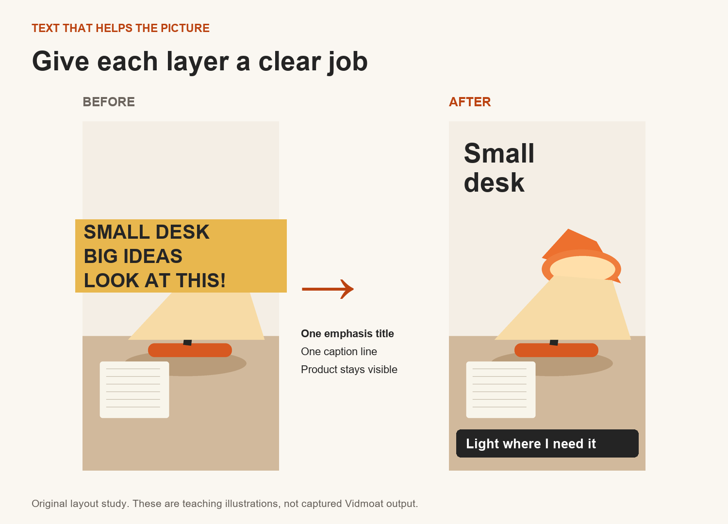
Captions carry the speech. Emphasis titles carry the important idea. You can use both, but they need different jobs. If every spoken word becomes a giant headline, there is no hierarchy left and the product disappears behind text.
For the review, keep captions near the lower part of the frame, with enough clearance for platform controls. Use a larger phrase such as “Small desk” beside the product when that idea arrives. The title can be shorter than the sentence because it is a summary. It must not change the claim.
Choose one type family, a small set of sizes and one accent colour. Vidmoat’s orange works well as an accent, while dark or light neutral text can provide the main contrast. Check the actual frame: orange against a warm lamp shade may be hard to read. A restrained shadow or background can help, but a stack of glow, outline and gradient can obscure the letter shapes.
SEE IT IN VIDMOAT · INTERACTIVE WALKTHROUGH
Give a title room to breathe
Real editor screenshots · September 2026 · Select a step, then tap the image to zoom.
Write the message
Add a Clean Title from Text, select its timeline clip, and open Style. Replace the content with Small desk. Big difference. This is an emphasis title, not a transcript.
Content changes the words; font, size and fill change their treatment.
Notice the collision
This first attempt places the title over the lamp. The words compete with the detail we want people to see. Pause before adding more decoration.
Ask what should get attention first: the product or the words?
Move into open space
Drag the selected title upward in the preview. The real captured edit clears the lamp. Next, improve size and contrast for your own footage and watch the whole shot.
Compare the two frames. Moving a title can solve more than adding an effect.
Step 1 of 3
Follow along in Vidmoat
- Choose one readable caption style and apply it consistently.
- Find the strongest three ideas in the edit and write short emphasis phrases.
- Add one larger title for an idea, positioned away from the speaker and product.
- Use orange on a key word or small accent, while maintaining clear contrast.
- Play the title at normal speed and confirm it stays long enough to read once comfortably.
A prompt you can adapt
Keep the speech captions readable and consistent. Add a larger “Small desk” emphasis title beside the lamp only when I discuss its footprint. Use orange as an accent, avoid covering the product, and do not animate every word.
Your turn
Make two title versions: a full spoken sentence and a three-word summary. Compare them on a phone-sized preview and choose the one that supports the picture.
What a successful attempt looks like
A viewer can tell which text is speech and which text is emphasis. Neither blocks the demonstration.
A common trap
Using the same size, position and animation for all text makes everything compete for first place.
Saved in this browser only. Download your notes from the course menu to keep a copy.
IN THIS LESSON
↙ Get the workbook